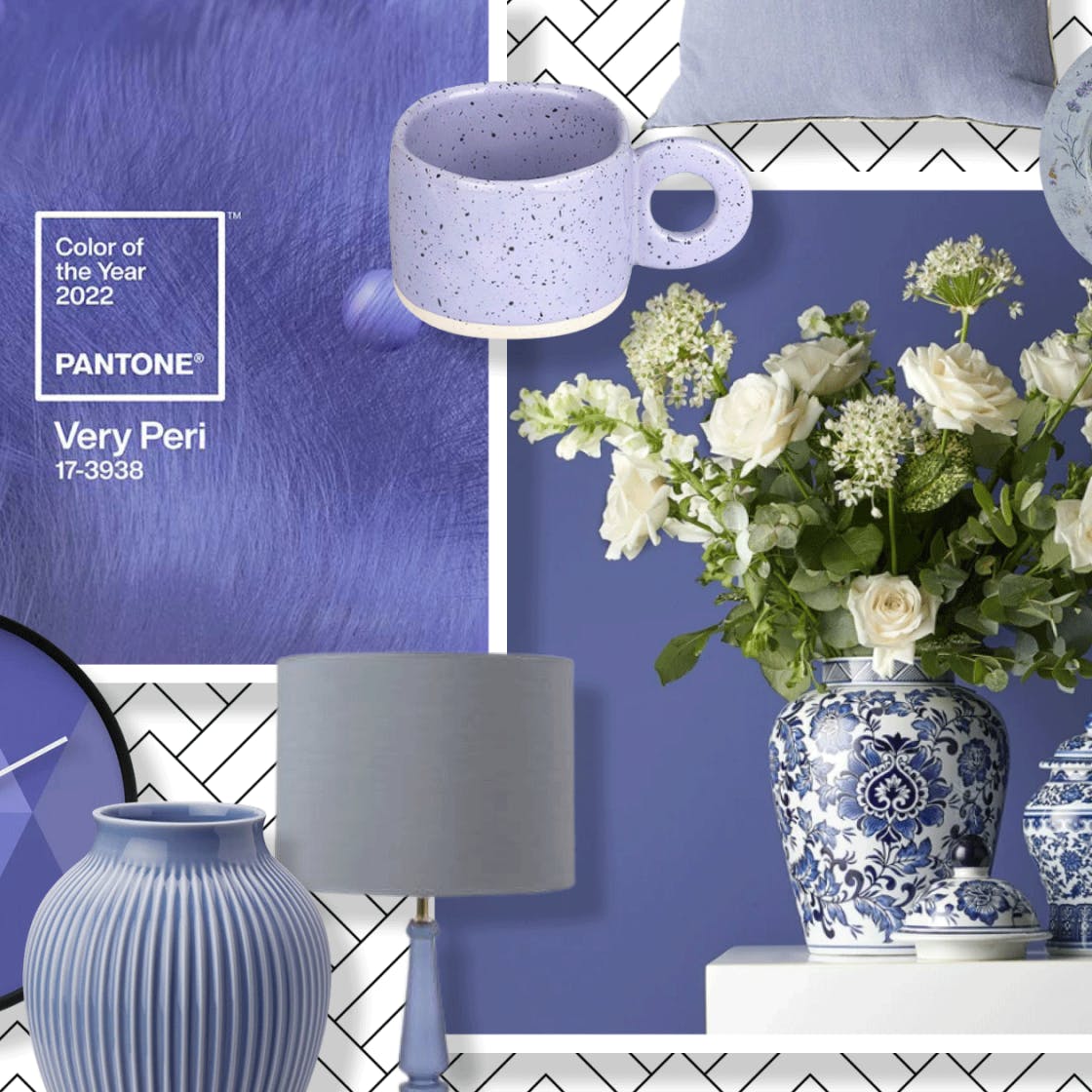
Colore Pantone 2022
Very Peri, un nuovo colore! - Very Peri, a new color!
Come ogni anno, da 23 anni circa, abbiamo atteso che Pantone, l'azienda specializzata nella produzione e nelle analisi delle ultime tendenze nel campo del colore, presentasse il nuovo trend che influenza molteplici settori come la moda e il design.
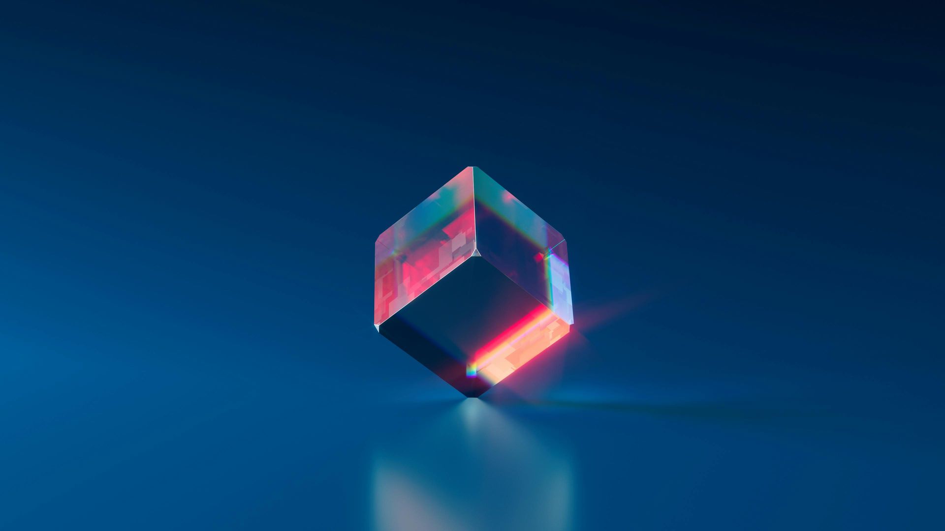
Very Peri 17-3938, questo è il nome del colore che per la prima volta non è stato scelto tra la palette esistente in archivio, ma prodotto ad hoc per l'anno 2022.
Qual'è il messaggio dietro a questa scelta?
Troviamo la risposta nelle parole del Vice Presidente dell'Istituto Pantone Laurie Pressman:
“La creazione di un nuovo colore per la prima volta nella storia del nostro programma, è il riflesso di un processo di innovazione e trasformazione su scala globale. Era davvero importante per noi perché ora abbiamo una visione del mondo molto nuova“ ha spiegato soprattutto riferendosi all’impatto che la pandemia COVID-19 ha avuto sulle vite di tutti noi, “aiutando ad allargare i limiti della realtà, aprendo la porta a un mondo virtuale dinamico in cui possiamo esplorare e creare nuove possibilità di colore“.
Pantone 17-3938 Very Peri, è la traduzione delle parole annunciate ovvero una complessa tonalità di blu con il rosso porpora che mira a “dare nuovo vigore a un mondo che cerca stabilità, resilienza e speranza“.
Pantone ha creato anche quattro palette di colori esclusive con Very Peri 17-3938 per aiutare ad introdurre questa tinta nel design di tutti i giorni.
"Balancing Act" è una palette di colori naturali con toni caldi e freddi che infonde una calibrata sensazione di vivacità e vibrazioni visive. Troviamo tonalità delicate di rosa, lilla, giallo e verde.
"Wellspring" un connubio di tinte ispirate alla natura come i verdi, i blu ed il giallo.
"The star of the show" grigi, marroni e bianchi, presenze sofisticate ed eleganti.
"Amusements" una storia di colori giocosi, divertenti che vogliono sperimentare nuove sensazioni. Ecco quindi tonalità arancioni, rosa e fucsia, blu e giallo.
Scopriteli tutti qui: https://www.pantone.com/eu/it/color-of-the-year-2022-palette-di-colori
"Il colore è un potere che influenza direttamente l’anima." Wassily Kandinsky
English version:
As every year, for about 23 years, we have been waiting for Pantone, the company specializing in the production and analysis of the latest trends in the field of color, to present the new trend that influences many sectors such as fashion and design.
Very Peri 17-3938, this is the name of the color that for the first time was not chosen from the existing palette in the archive, but produced ad hoc for the year 2022.
What is the message behind this choice?
We find the answer in the words of the Vice President of the Pantone Institute Laurie Pressman:
“The creation of a new color for the first time in the history of our program is a reflection of a process of innovation and transformation on a global scale. It was really important for us because we now have a very new vision of the world "he explained above all referring to the impact that the COVID-19 pandemic has had on the lives of all of us," helping to widen the limits of reality, opening the door to a dynamic virtual world in which we can explore and create new color possibilities “.
Pantone 17-3938 Very Peri, is the translation of the announced words or a complex shade of blue with purple red that aims to “give new vigor to a world that seeks stability, resilience and hope“.
Pantone also created four unique color palettes with Very Peri 17-3938 to help introduce this hue into everyday design.
"Balancing Act" is a natural color palette with warm and cold tones that instills a balanced sensation of liveliness and visual vibrations. We find delicate shades of pink, lilac, yellow and green.
"Wellspring" a combination of colors inspired by nature such as greens, blues and yellows.
"The star of the show" gray, brown and white, sophisticated and elegant presences.
"Amusements" a story of playful, fun colors that want to experience new sensations. So here are shades of orange, pink and fuchsia, blue and yellow.
Discover them all here: https://www.pantone.com/eu/it/color-of-the-year-2022-palette-di-colori
"Color is a power that directly affects the soul." Wassily Kandinsky